The basics
Image
An image is a box that shows a photo. You decide the box's size and shape; the photo is cut to fit it.

How to make one
- Press I, or choose Image in the toolbar.
- Drag on the page to set its size. A window opens to choose a photo from your computer.
- Or close that window, and pick one of your images under Image in the Design tab.
Fill or Fit
A photo is rarely the exact shape of its box. Fill crops it to cover the box; Fit shows all of it.
Photo
Put an image set to Fill beside a box of words, in a row, and they share the width:
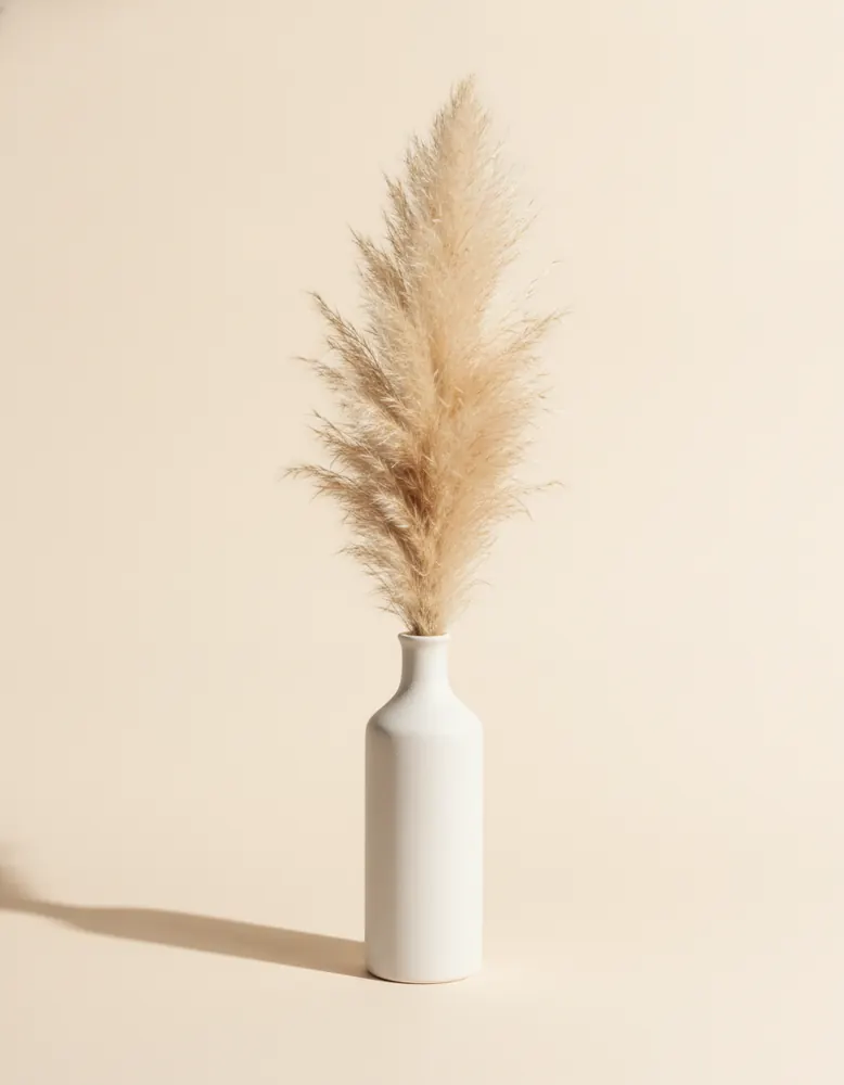
Thrown by hand, fired twice
Every vase starts as a lump of local clay and leaves the studio three weeks later.
See the collectionDesign
- Image
- Pick from your images, upload a new one, or paste an image address.
- Fill, Fit
- Crop to cover the box, or show the whole photo.
- Description, for screen readers
- A few words saying what the photo shows, for people who can't see it. Search engines read it too.
- Size
- Fixed, Hug or Fill, the same as any box.
- Corners, Border, Shadow
- Round the corners all the way for a circle; a border frames it.
Behaviour
- Shows
- Inside a component, an image can show a product's photo instead of the one you picked. A list then fills it in for each product.
- On hover, show
- A second photo when the pointer is over it: the back of a shirt, or the product in use.
- When clicked
- Follow a link, open a pop-up, and more.